Visual Identity & Packaging Design for
Miss Molly's Honey
Background and Strategy
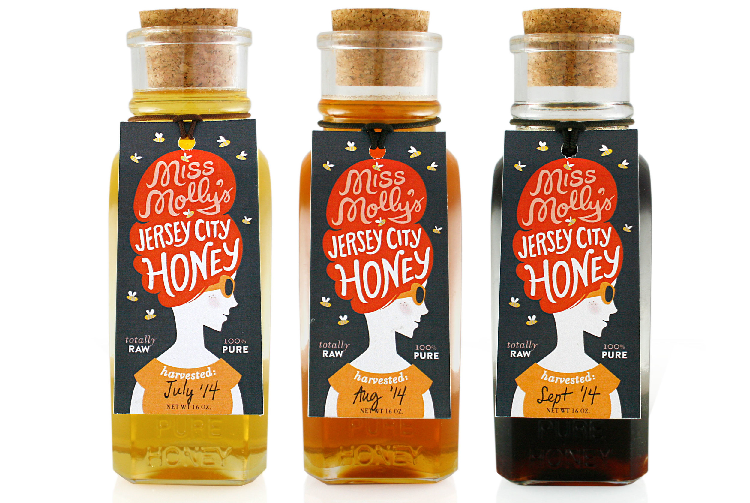
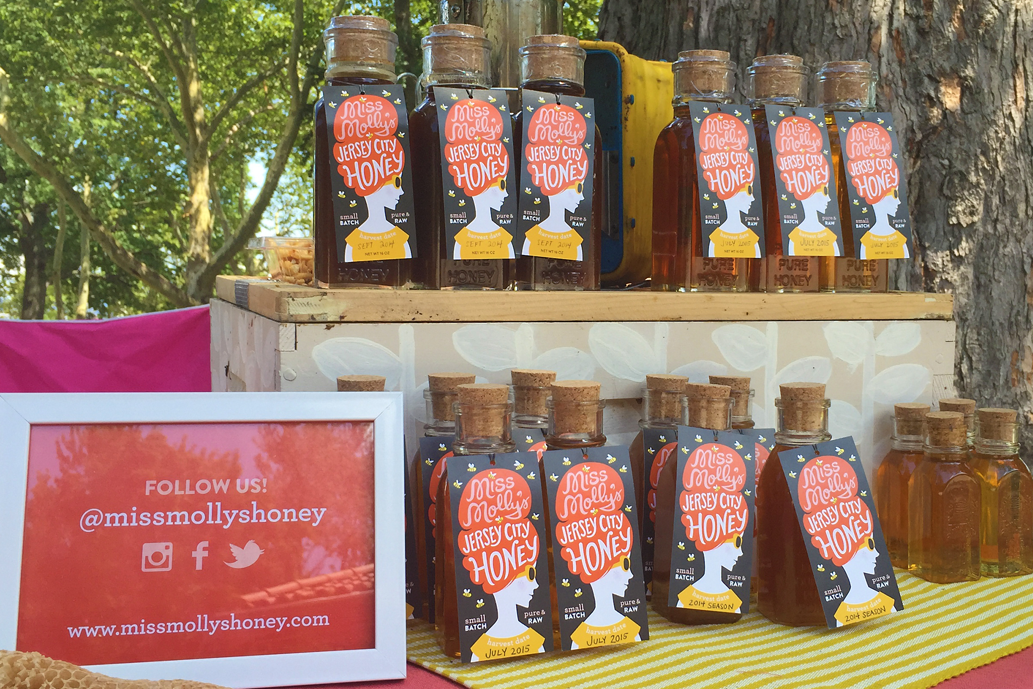
Miss Molly’s Honey is a passion project of Molly Conley Design. Located in Jersey City and New York City, Miss Molly's Honey is marketed around its urban locations, where raw, artisanally produced, small batch honey is rare and highly desirable. While quality, location and authenticity of our products is of utmost importance, we saw this as more as the price of admission for a new brand appealing to young, urban professionals. For the label itself, we wanted to take bold, modern, graphic approach that is strikingly different from other honey labels. Our authenticity proof points, especially the small batch date of harvest information, would be present but not the sole guiding force for design.
Packaging Design
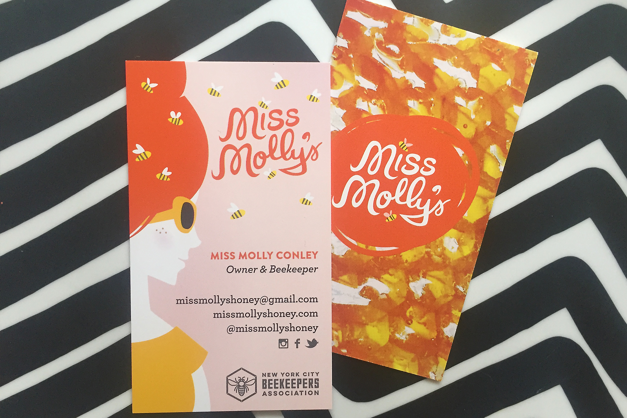
The focal point of the label is a hip persona named Miss Molly, a vintage-loving young woman wearing a 1960s-inspired beehive hairdo equipped with flying bees. This bold, graphic and playful design to intended to appeal to urban professionals, while shattering stereotypes about honey packaging and beekeepers.
The color palette is intensely contrasting between foreground and background (from charcoal gray to white) to creative a distinct, legible shape that attracts attention from a distance. The secondary color palette of oranges and yellows are designed to pair nicely with the color of the honey as it changes through the season, and the light pink color is meant to convey sweetness and femininity. The slender glass jars work well with the orientation of our vertical labels and the corked lids seem to nicely represent the idea of artisanal production of small batch honey.
Total Scope of Deliverables
- Logo and visual identity
- Packaging design
- Business cards
- Website design