Voi Hyvin Honey Squeeze Tube Design
Background and Strategy
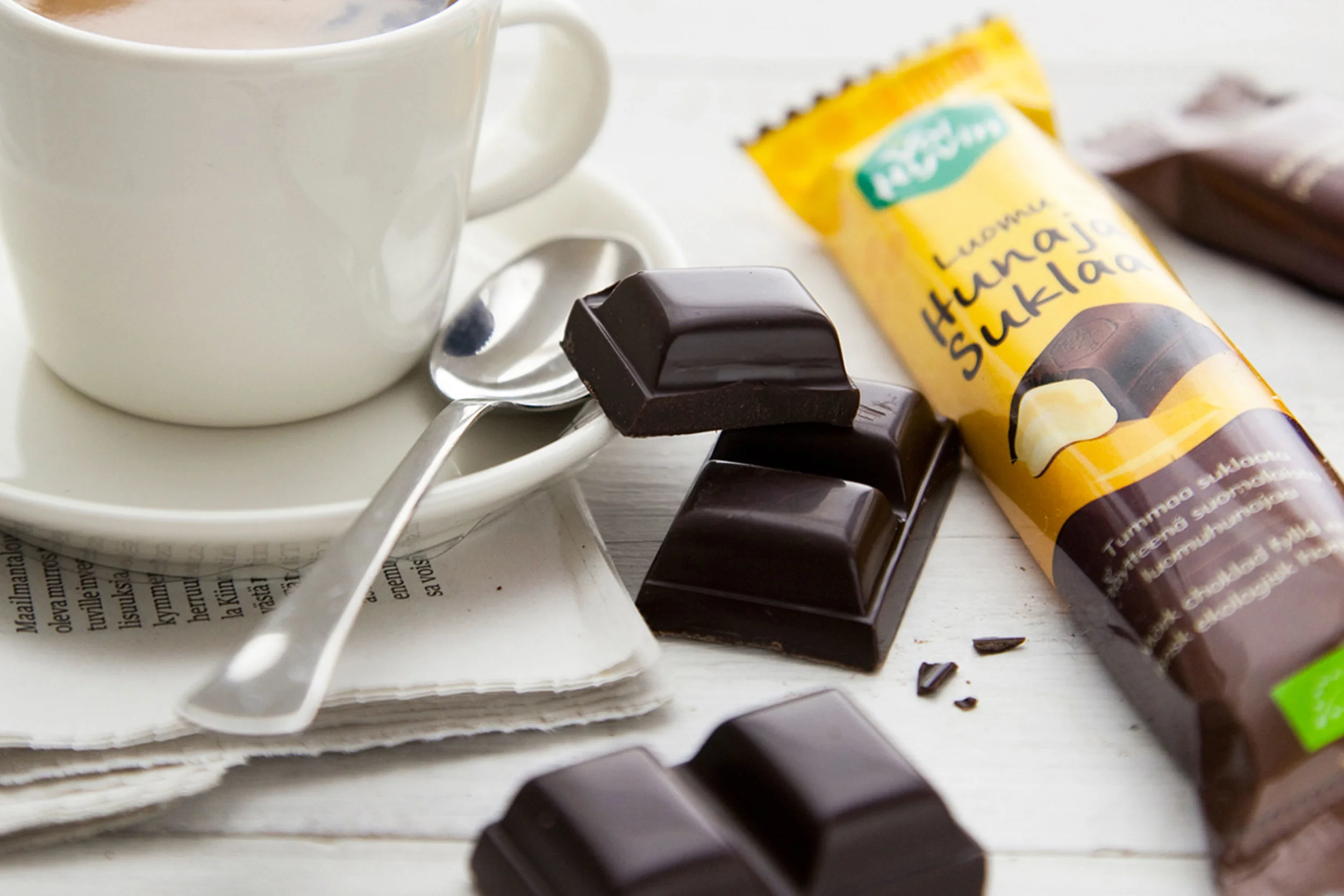
After we completed the rebrand of Voi Hyvin's website and Honey Chocolate bars, the organic honey brand next wanted to update its signature product, a squeezable tube of organic honey. Because the previous honey tube had a high level of brand equity and recognition among Voi Hyvin's customers, we took measured and thoughtful steps to enhance and evolve the design.
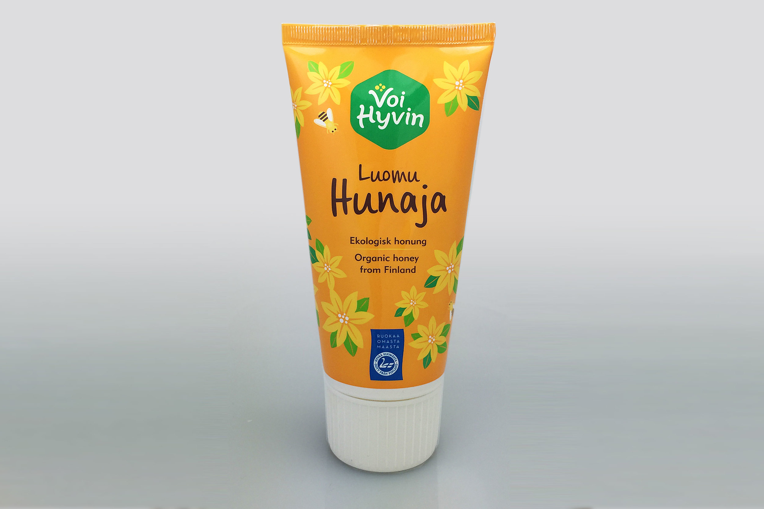
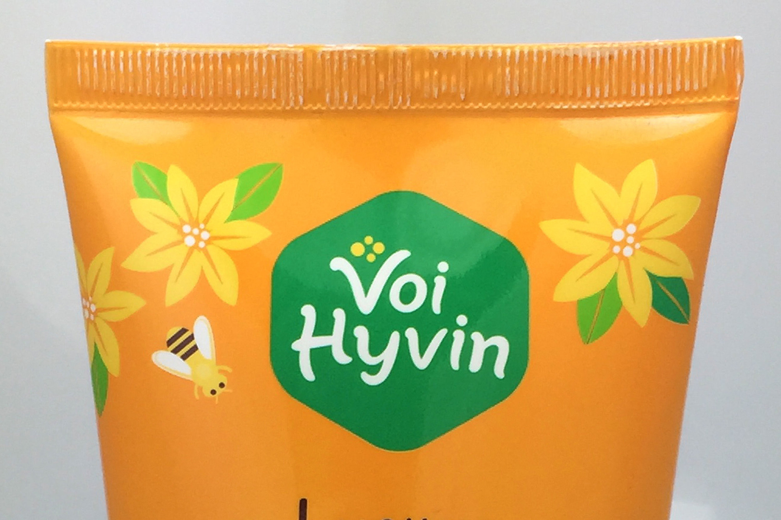
Additionally, we wanted to correct an occasional misconception about the product, which at-a-glance has been mistaken for a tube of hand lotion because of a combination of packaging choice and floral illustrations (with no visual reference to bees or honey).
Packaging Design
As one of the only honey brands in Finland offering the convenient squeeze tube, we kept this packaging choice which has been well received among Voi Hyvin's customers. The design borrows from the yellow color and most basic elements of the previous tube, but updates the artwork for a more legible and inviting packaging design. The updated design includes not only the brand's new logo and new artwork, but the addition of new honeybee illustrations to subtly help contextualize the product as a tube of honey.
Total Client Deliverables
Voi Hyvin's website design was part of a larger brand update. In total, we delivered
- Logo redesign and updated visual identity
- Packaging design for Voi Hyvin Honey Chocolate Bars
- Packaging design for Voi Hyvin Honey Squeeze Tube
- Packaging design for Voi Hyvin Honey Paper Tub
- Custom product illustration
- Website design
- Point of purchase sale signage